FOLDED POSTCARD
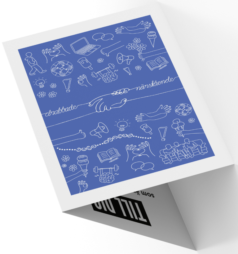
This folded postcard was designed for Ung Cancer, a Swedish organization supporting young adults affected by cancer. The design aims to convey warmth, community, and support through a visually engaging and informative layout, that can be handed out to potential new members of the organization. It is a folded card in the format 105 x 148 mm.
The cover features a blue background with white line illustrations, symbolizing themes of connection, care, and shared experiences. The hand-drawn elements, including hands, flowers, books, and speech bubbles, create an inviting and personal feel, and gives a small sense of what the organization has to offer for its members. A central handshake motif with the words "drabbade – närstående" (affected – relatives) emphasizes the bond between individuals impacted by cancer.
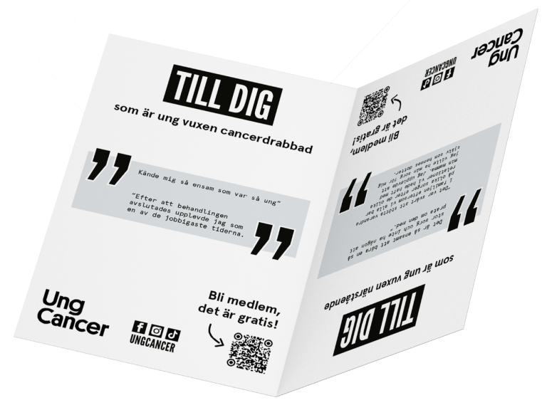
If you open the card from one side, it is for those who are affected by cancer, and from the other side for relatives. The interior follows a bold, modern, and structured layout. Large quote blocks highlight real experiences from young adults, making the message personal and impactful. Clear calls to action, including a QR code for easy membership access, reinforce engagement while maintaining an uncluttered, accessible design. This project combines a design that is both aesthetically appealing and purpose-driven, in line with Ung Cancer's graphic profile.
POSTER & BROCHURE
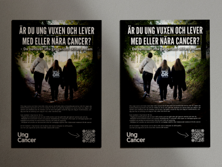
Ung Cancer’s advocacy work is a vital complement to the direct support offered to young adults affected by cancer and their families. It plays a key role in driving long-term change by spreading knowledge and raising awareness. More people within healthcare, government agencies, and among decision-makers, need to understand the realities faced by young adult cancer survivors and caregivers, as well as their needs. Their voices must be heard, and they should have the opportunity to participate in discussions and decisions that impact their lives. Every young adult affected by cancer, along with their loved ones, has the right to receive support tailored to their individual circumstances.
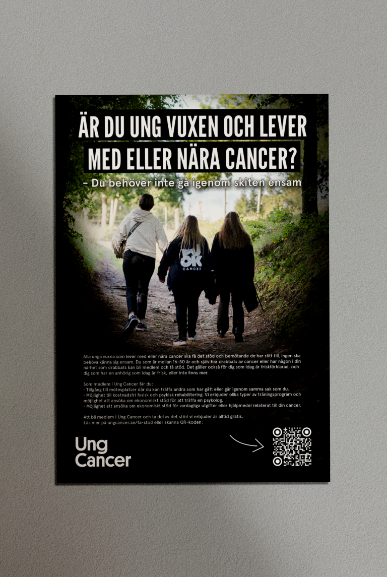
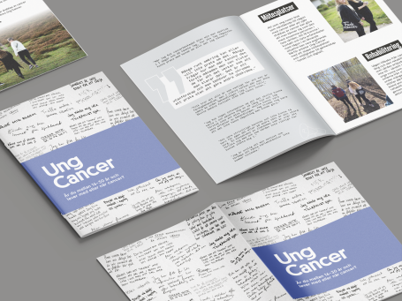
For this information campaign, I designed a poster and brochures that align visually with the DE UNGA BAKOM CANCERN report. These materials serve as a complement to the report and are primarily targeted at young adults who may be potential new members, either those affected by cancer themselves or those close to someone who is. To foster recognition and a sense of belonging, the design incorporates quotes from current members, reflecting shared experiences. The posters and brochures have been distributed to health centers, hospitals, and youth clinics, places where the target audience is most likely to encounter them.
SWISHA GLASSPENGEN
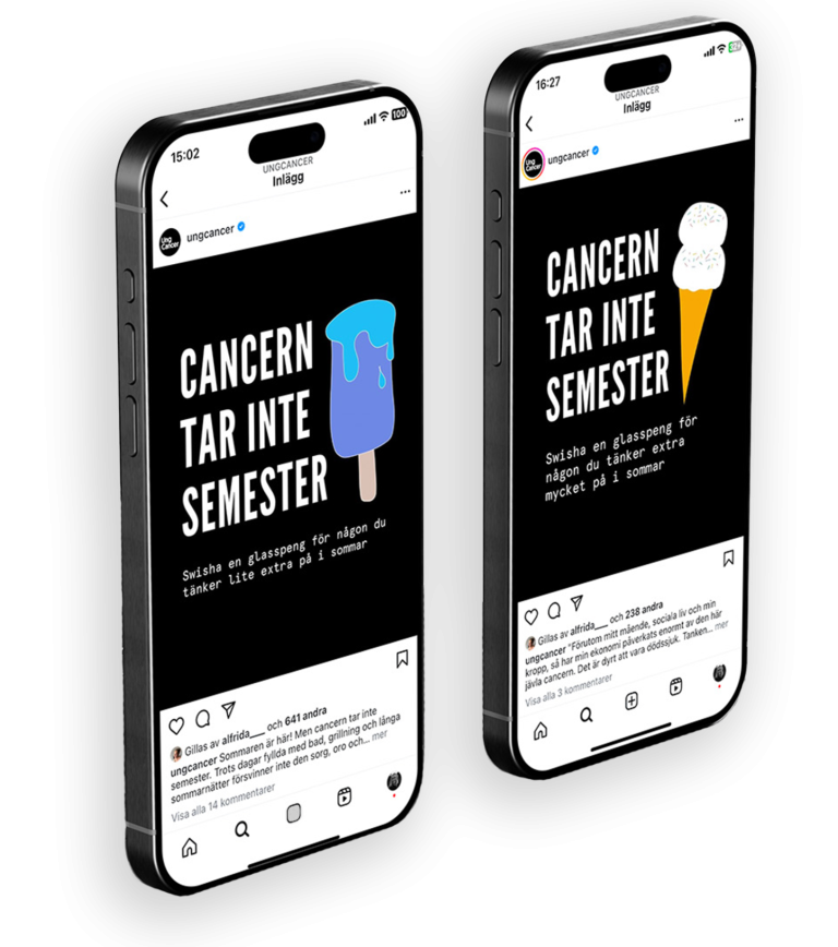
Ung Cancer's 2024 summer initiative, the "Ice Cream Campaign," invites people to donate the cost of an ice cream via Swish. Due to its success in previous years, the campaign is being repeated, running from late June through August. The primary goal is fundraising to support more members.
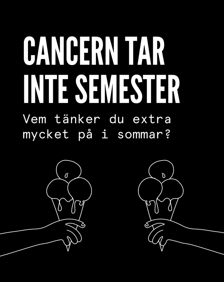
The campaign is promoted to existing donors, social media followers, and new donors through targeted ads, mainly on Meta and Google. The message, "Cancer doesn't take a vacation," highlights the contrast between the joy of summer and the continued struggles of cancer. Summer often means hope for the future, time after graduation and a long summer vacation, but illness, sadness and loss do not disappear despite days of swimming, barbecues and long summer nights. For young adults with cancer and their families, summer can be a particularly difficult time. By contributing the price of an ice cream, donors can help ensure that members of Ung Cancer can receive the support they need.
For this campaign, my role was to create illustrations of new ice creams and people holding them for use in the promotional materials.
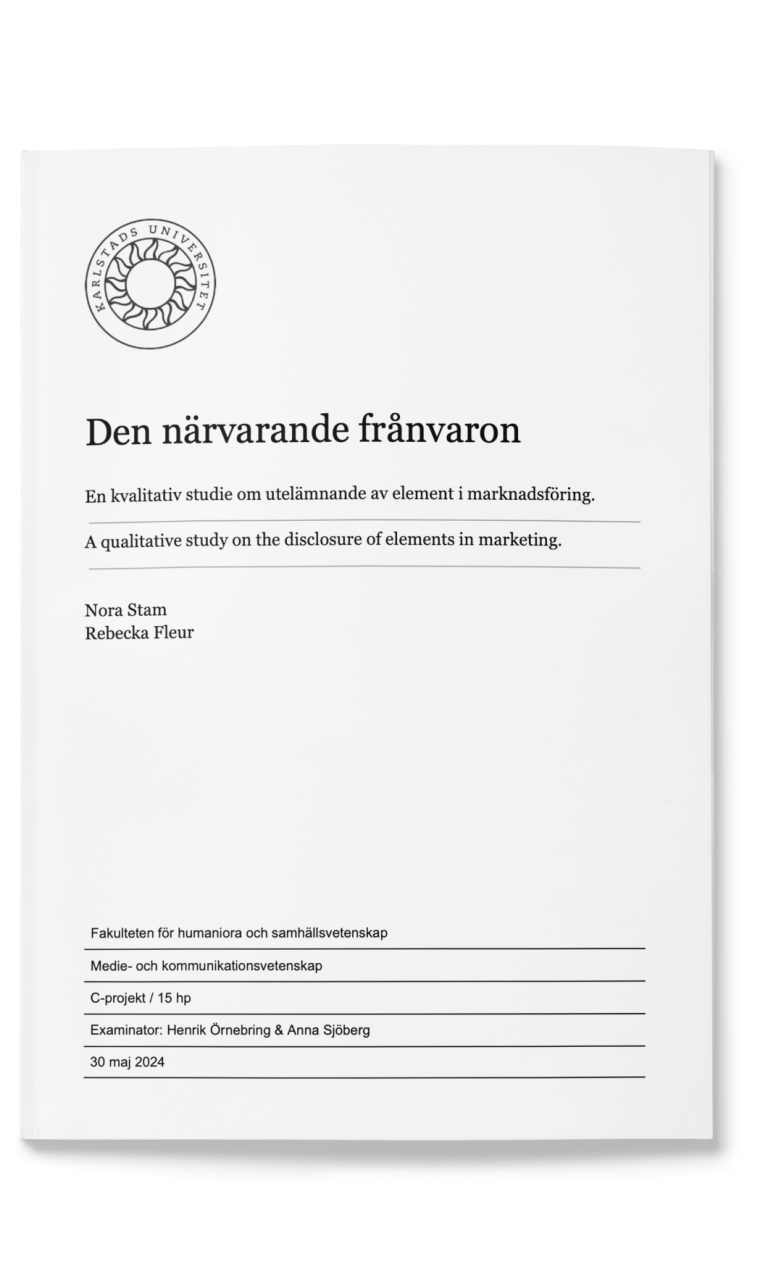
BACHELOR THESIS
This thesis explores how marketing strategies that omit central products or key elements can effectively engage audiences. By analyzing advertisements from Barncancerfonden and Sverige för UNHCR, the study examines how the absence of key elements can play a communicative role. A multimodal visual analysis is employed to investigate how various semiotic resources—such as images, symbols, and visual signs—create meaning when the main object is missing.
The study aims to understand how organizations use these strategies in their marketing campaigns and how they could be applied in commercial advertising. Drawing on previous research and theoretical frameworks such as social semiotics and visual rhetoric, the thesis provides insights into how the omission of elements can evoke strong emotional reactions and audience engagement. This research offers valuable perspectives on marketing communication, particularly in how emotional marketing can strengthen messages and create deeper connections between brands and their target groups.
DE UNGA BAKOM CANCERN
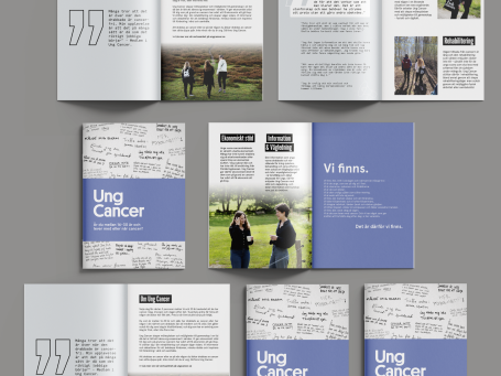
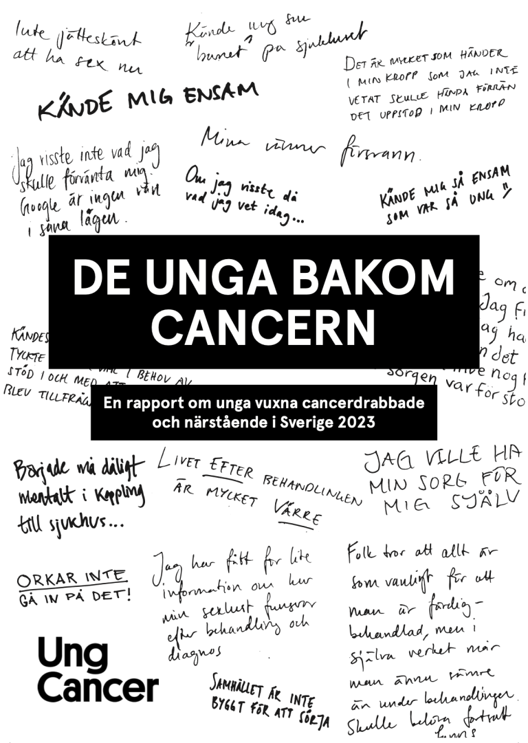
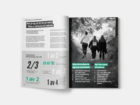
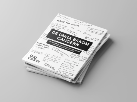
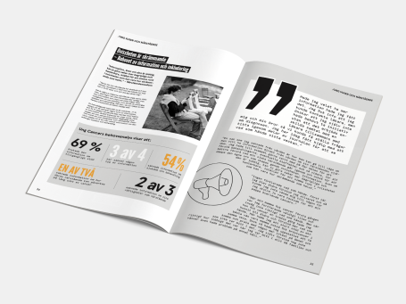
On April 9, Ung Cancer released the report DE UNGA BAKOM CANCERN - En rapport om unga vuxna cancerdrabbade och närstående i Sverige 2023. This report amplifies the voices, needs, and experiences of young adults affected by cancer, as well as their families who stand by them.
The report is based on an analysis conducted among young adults affected by cancer and their relatives, trough surveys, interviews, and focus groups. Its goal is to explore how these young adults feel, the support they require, and what assistance they have received. It also aims to raise awareness of their needs among the general public, cancer care professionals, and relevant agencies. Through quotes, personal stories, and survey data, the report reveals that Ung Cancer’s members share common experiences of significant unmet needs and a lack of support.
I was responsible for all graphic design, illustrations, and layout for the report, which consists of 54 pages and was printed in 400 copies.
MARYTALE FILMBYRÅ
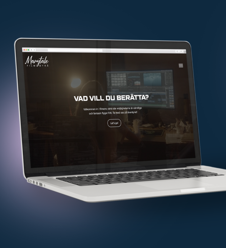
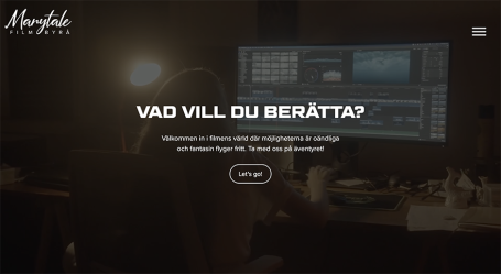
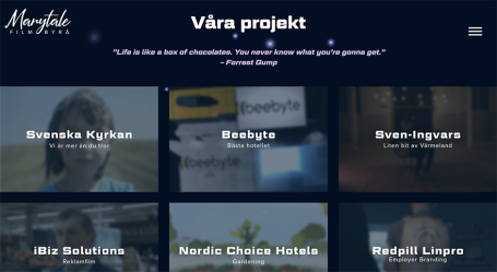
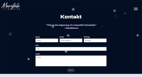
Marytale, a film agency based in Karlstad, reached out to us students to redesign their website. Our project team took the opportunity to not only revamp the site but also refresh their existing graphic profile. We developed new materials and created an easy-to-navigate website on WordPress that strikes a balance between a personal, approachable tone and a professional, high-quality image. The website’s language is casual yet aligns with the company’s ethos and expression.
Marytale is passionate about narrative and storytelling, and we wanted this to be at the heart of the redesign. To convey the right tone, we incorporated playful language, movie quotes for humor and familiarity, and vibrant design elements to give the site a more personal feel.
To further emphasize the company’s personality, we drew visual inspiration from space, using colors, typography, and shapes that evoke dreams, boundlessness, mystery, infinity, and adventure—mirroring the limitless possibilities of film.
CLASS FLASH APP
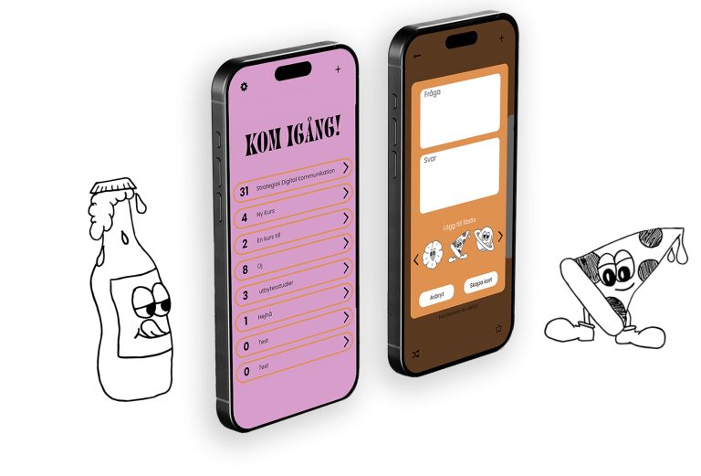
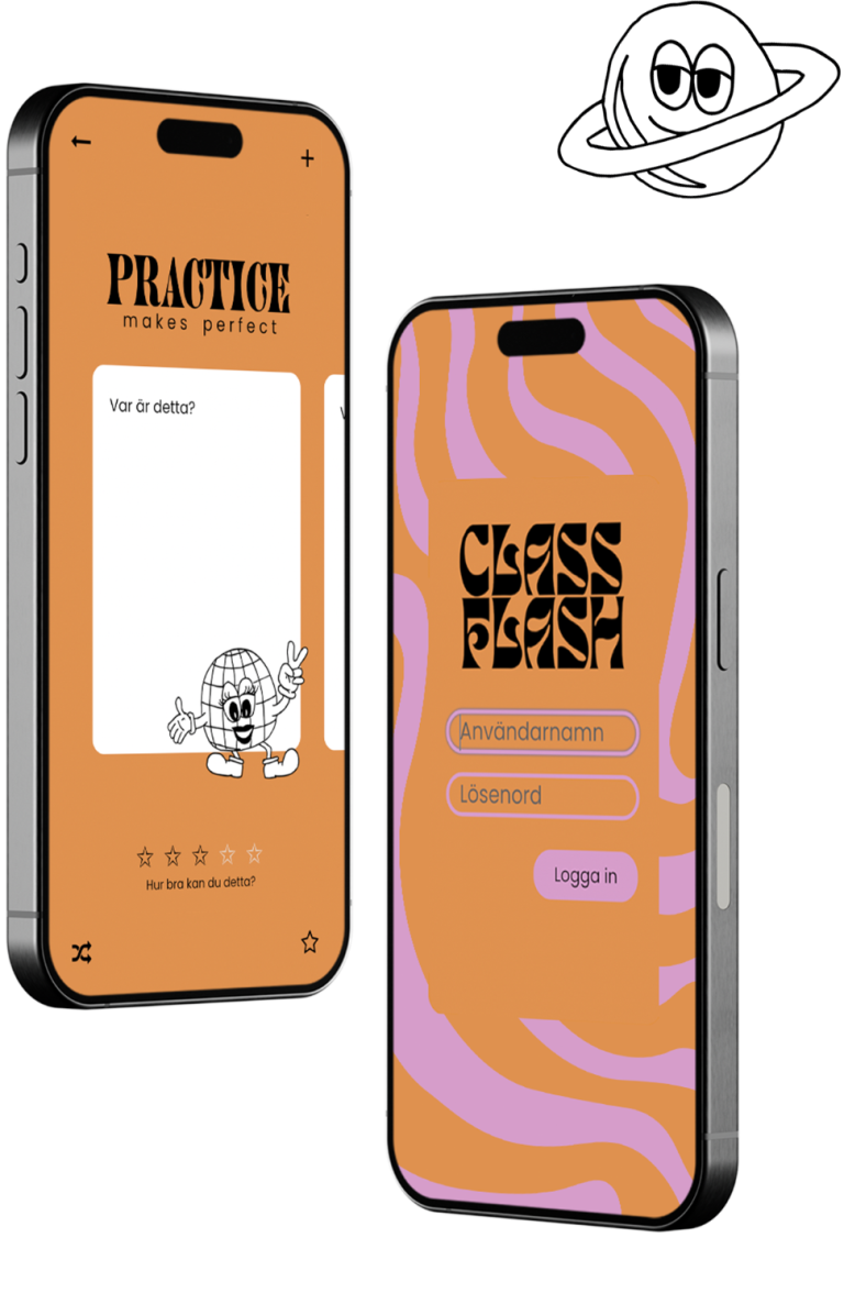
Class Flash is an app I designed and developed as part of the Strategic Digital Communication course. The app is aimed at helping students study through flashcards, with the added feature of allowing classmates to share and download each other's card sets. It’s designed not only to be a practical study tool but also to make learning enjoyable and engaging.
The app's color scheme plays a key role in its user experience. Orange, symbolizing joy, security, simplicity, and spontaneity, was chosen to evoke positive and desirable emotions during study sessions. Pink adds a youthful and playful touch, enhancing the sense of fun and creativity.
The illustrated figures serve a dual purpose: they motivate users to keep studying and aid in memory retention by making the learning process more visually stimulating.
THE IRISH CREW
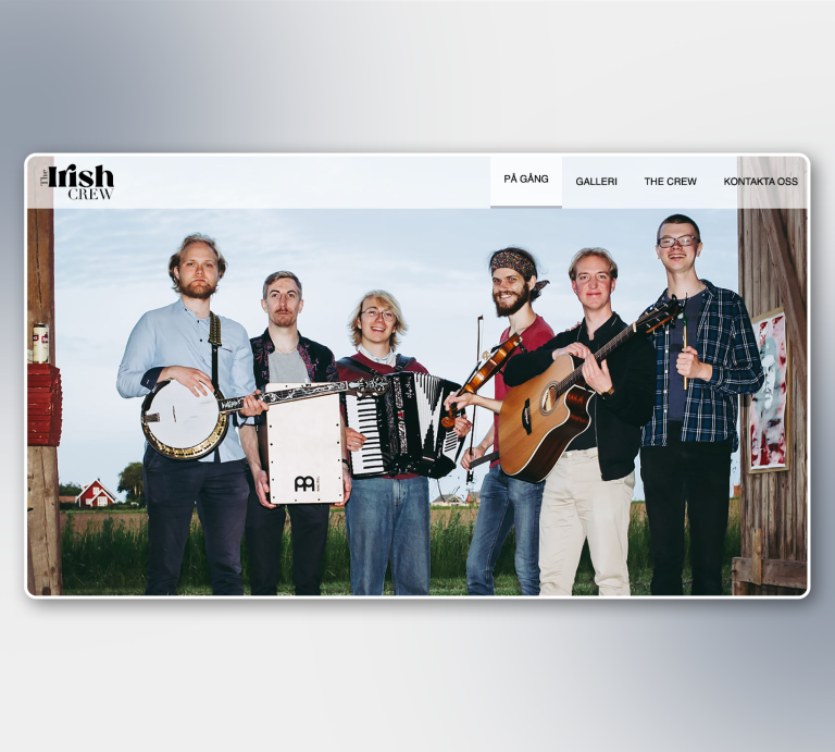
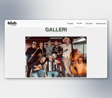
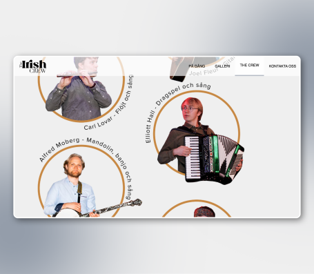
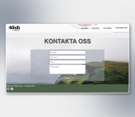
I designed and developed a website for the band The Irish Crew, utilizing a combination of HTML, CSS, PHP, and JavaScript. My goal was to create a responsive, user-friendly one-page website that would work seamlessly across devices. A key focus was on making navigation simple and clear, allowing users to easily access information about the band, upcoming shows, and media content.
For the visual identity, I took inspiration from the landscapes of Ireland, integrating natural tones and textures that evoke the country’s rich and rugged environment. This approach formed the foundation of the graphic profile, which moved away from the traditional design elements commonly found in Irish pub environments—like heavy wood textures, green hues, and Celtic motifs. Instead, I aimed to create a more refined and minimalist aesthetic that would still capture the essence of Irish culture, but in a sleek, modern way. The result is a visual identity that feels fresh, contemporary, and clean, while still connecting to the band's roots.
RENEWD MAGAZINE
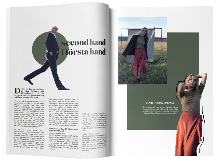
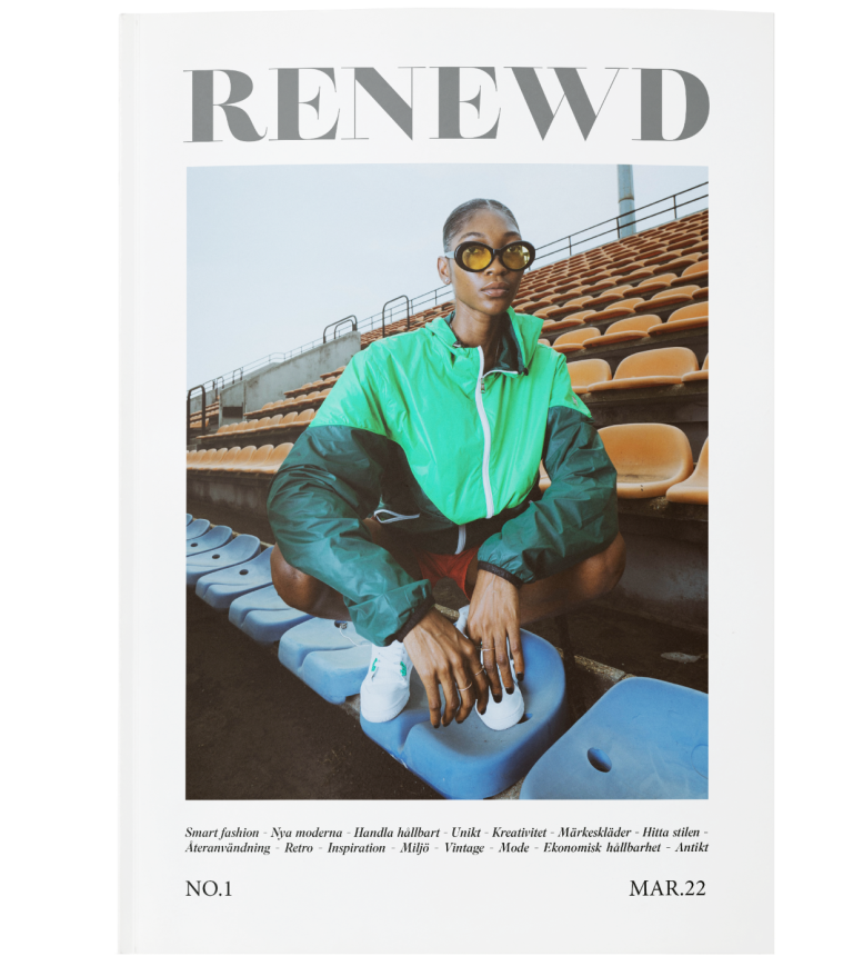
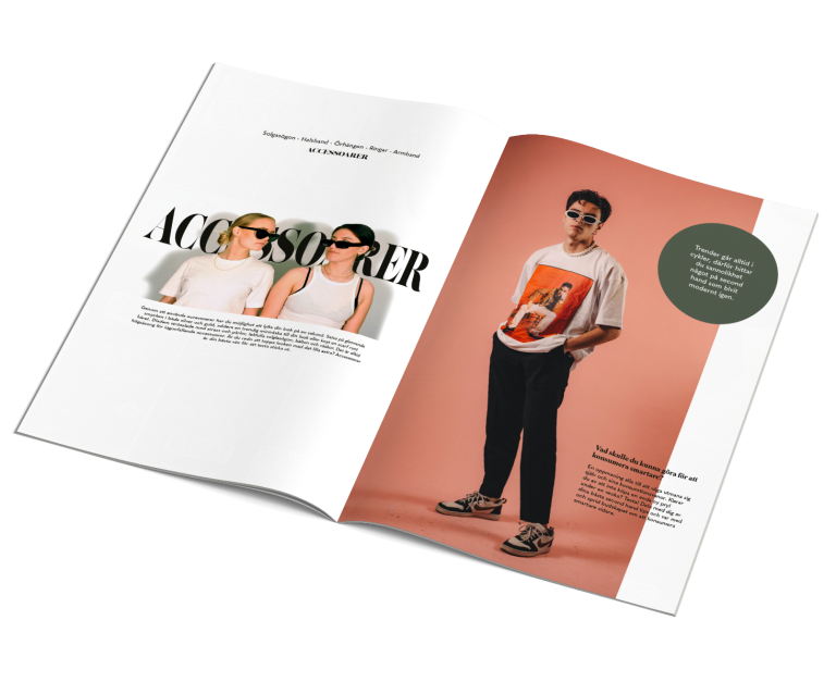
RENEWD is a stylish, clean magazine focused on second-hand shopping. With no established genre codes to follow from similar publications, the magazine offers a great opportunity for creative freedom. The challenge lies in developing an appealing design language that speaks to a style-conscious and fashion-forward audience while promoting an understanding of sustainable consumption. The magazine needs to balance elegance and sophistication with a sense of creativity, showcasing how second-hand shopping can offer unique, bold expressions of personal style.
The goal was to create a visual identity that resonates with both men and women. I focused on using ample white space to convey an airy, fresh aesthetic. For the visuals, I combined images sourced from Unsplash with my own photography, featuring friends as models in a studio setting. This mix of professional and personal elements helped to highlight the individuality and charm of second-hand fashion.
© 2025. All rights reserved.
Vi behöver ditt samtycke för att kunna hämta översättningarna
Vi använder en tredjepartstjänst för att översätta innehållet på webbplatsen, vilken kan samla in uppgifter om dina aktiviteter. Läs informationen i integritetspolicyn och godkänn tjänsten för att hämta översättningarna.
